You have read his work for years. You have never once seen his name.
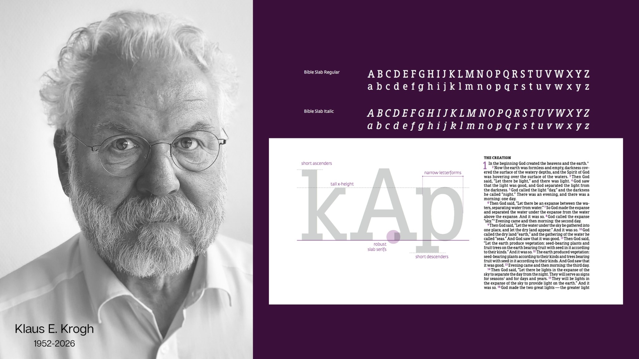
Open a Bible. Any Bible, in almost any language, printed in the last twenty years.
Somebody chose the shape of every letter on that page. Somebody decided how far apart the lines sit, how tall the lower-case letters stand against the capitals, how much of the paper the text block occupies and how much is left as margin. Somebody worked out how to fit roughly 780,000 words onto paper thin enough to carry without the ink from one side showing through the other.
For an extraordinary number of the Bibles now in print, that somebody was a Danish designer called Klaus E. Krogh. He died on 6 October, suddenly, at 74.
The problem he spent his life on
Bible typography is its own discipline, and the reason is arithmetic.
A novel can be set generously. A Bible cannot. It is one of the longest books most people will ever own, and it is expected to be portable, which means thin paper and tight leading and type small enough to be uneconomical to read badly. Every millimetre of line spacing you give the reader costs pages, and pages cost weight. Make it beautiful and it becomes a brick. Make it compact and it becomes unreadable. The entire craft sits in that squeeze.
Krogh's answer was three typefaces, designed specifically for the problem and now familiar to Bible readers who have never heard of them: Bible Serif, Bible Sans and Bible Slab.
Each solves a different part of it. Bible Serif is the elegant one — narrow without being condensed, short ascenders and descenders so more lines fit per page, a generous x-height and open letterforms so no letter collapses into its neighbour at small sizes. Bible Sans is the space saver. Bible Slab is the workhorse: his firm describes its low-contrast design as able to "withstand even the toughest printing conditions," and claims it can deliver a fully readable Bible in no more than 600 pages.
Six hundred pages. For the whole Bible. That is the kind of number that means nothing until you have held the alternative.
Krogh was precise about where readability actually comes from, and it was never one grand decision.
When people see a Bible that they recognize as readable, it's all these choices that made it readable: the typeface, the size, the kerning.
Kerning. The space between two particular letters. He is describing a discipline where the work is invisible by design and the result is unmistakable.
Where he learned it
He started as a graphic designer and production manager at the Norwegian Bible Society, from 1982 to 1987, making hymn books and Bibles. Five years of learning the specific constraints of religious publishing from the inside.
In 1987 he and his wife founded their own company and called it 2Krogh. They renamed it 2K/Denmark later, for a reason he enjoyed telling: they could not make Bibles, he said, with a company that sounded like it was named 2 Crooks.
From there the work spread. The firm came to handle typesetting and production for complex texts in more than 43 countries, working with HarperCollins Christian Publishing and the United Bible Societies among others. For Zondervan they built the Comfort Print family — 24 individual fonts across three typefaces, which Zondervan's associate publisher Melinda Bouma has called the largest known font commission in history.
Then a stranger asked him for something
At an Evangelical Christian Publishers Association event, a woman approached Krogh and told him somebody needed to design a Bible for people with dyslexia — a condition that, by the figure Christianity Today cites, affects up to a fifth of the world's population.
He took it on. 2K/Denmark spent years working with researchers at Cambridge University, who had spent decades building tools for testing reading and reading disability. The result was a typeface called Grace.
What makes it work is a series of small, deliberate interventions. The letters carry extra weight at the bottom, which anchors them to the baseline and stops them floating as dyslexic readers often report. Spacing and serifs are altered inside the letterforms so that b and d, p and q stop collapsing into one another. The leading is opened up. It is set at eleven point, with no bold, no italics and no footnotes, and no block of text runs longer than eleven lines. The children's edition adds coloured overlays to cut the contrast and lower the visual strain.
Lifeway and Crossway both published dyslexia-friendly Bibles using the work.
The decision that makes this our kind of story
Here is how Krogh's business normally ran. His firm designed a typeface and sold it to a single publisher, who then owned it. Exclusive. That is where the money is.
With Grace, he deliberately did the opposite. He made it nonproprietary — licensable by organisations for a fee, and free to individuals for personal use. He gave away the one he had made for the people who find reading hardest.
He explained why to Christianity Today in 2024, and it is worth reading twice: the ability to do good, he said, by giving people a tool that let them read better, had become more important to him than squeezing the last dollar out of the idea.
If you are about to publish a Bible, you have no excuse not to make it readable. Unreadable Bibles are of no use.
Klaus E. Krogh, 1952–2026
This magazine is named after a parable about three people handed different amounts and judged on what they did with them. The servant who is criticised did not steal anything. He buried his portion to keep it safe.
Krogh was handed an unusually specific talent — an eye for the space between letters — and spent forty years aiming it at a single book. Then, at the end, he declined to own the most useful thing he ever made.
What he left
He is survived by his wife Liv, two daughters and two grandchildren. His daughter Lea Rathje chairs the board of the company he and his wife started.
She and the firm's chief executive Sune Andersen wrote that his two great passions, typographic design and the Word of God, had found their perfect union in this work, and that they intend to carry it on — to make the next Bible their best one yet.
He put the standard plainly himself, and it reads now like an instruction left behind for everyone still in the trade.
Sources
- Died: Klaus Krogh, Pioneer in Bible Design and Accessibility, by Taylor Berglund, 26 October 2026, Christianity Today
- And the Word Became Accessible: Publishers Release Dyslexia-Friendly Bibles, 13 November 2024 - for the Grace design detail and Krogh's reasoning on making it nonproprietary, Christianity Today
- A Revolution in Bible Design: Meet the People Who Designed Your Bible, by Mark Ward, November 2021, Bible Study Magazine
- 2K/BIBLE FAMILY typeface portfolio - Bible Serif, Bible Sans and Bible Slab, 2K/DENMARK
- Comfortly Readable, by Melinda Bouma, Associate Publisher, HarperCollins Christian Publishing - for the Comfort Print commission, 2K/DENMARK

5Talents
Written by the 5Talents editorial desk.